Inbox commands
The bot and operator can interact with one another in the Inbox using events. The bot can emit inbox commands (such as a toast message, an autocomplete suggestion, or an entire form) at any time. The operator can only trigger events using a predefined button in a commands.yaml file.
The full list of commands and their options are available at the inbox commands reference.
Getting started
Toast message
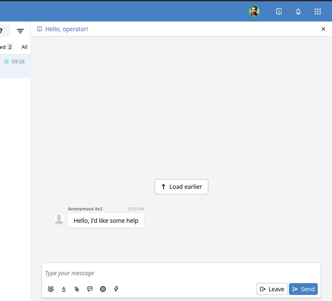
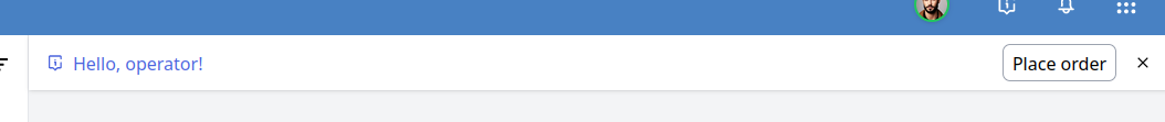
Let's start with a simple example: sending a toast message to the inbox when an operator takes over the conversation.
task event: "$operator_join" do
  emit "$inbox", Inbox.toast("Hello, operator!"), to: :operator
end
You might also want your operators to explicitly request the bot for information. For this, we'll need a commands.yaml:
commands:
  crm_lookup: {}
ui_commands:
- command: crm_lookup
  caption: Lookup user in CRM
And a task:
task event: "crm_lookup" do
  # Exercise for the reader: do a CRM lookup
  # Toasts support markdown:
  emit "$inbox", Inbox.toast("CRM: [#{_crm_user.name}](https://link-to-user-in-crm)"), to: :operator
end
This will render as a button in the chat input:
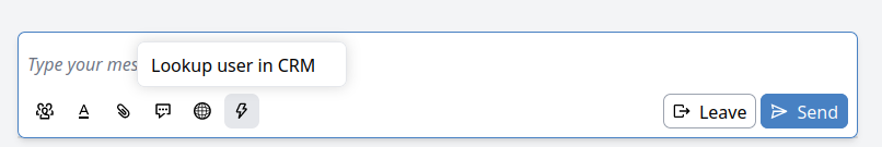
When this button is clicked, it will send the "crm_lookup" event to Bubble.
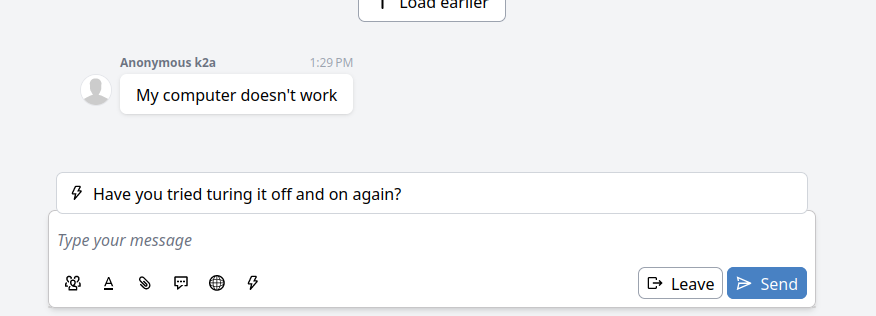
Suggestions
Suggestions allow the bot to suggest chat messages to the operator. For example:
task __init__ do
  has_tried_powercycle = false
end

task before: __user_message__ do
  if conversation.operator and not has_tried_powercycle do
    emit "$inbox", Inbox.suggest("Have you tried turing it off and on again?"), to: :operator
  end
end
You may also pass multiple strings as suggestions to Inbox.suggest.
Suggestions may also contain Markdown, so it's possible to pass, for example, links.
Support for Markdown depends on the channel.
Set input
Rather than merely suggesting a reply, you can also directly set the input of the agent's chat input. This should likely be reserved for commands that were invoked by the agent (UI commands, see below).
task event: "make_passive" do
  _current_chat_input = event.payload.input
  _passified = # use AI to change the tone of the input
  emit "$inbox", Inbox.set_input(_passified), to: :operator
end
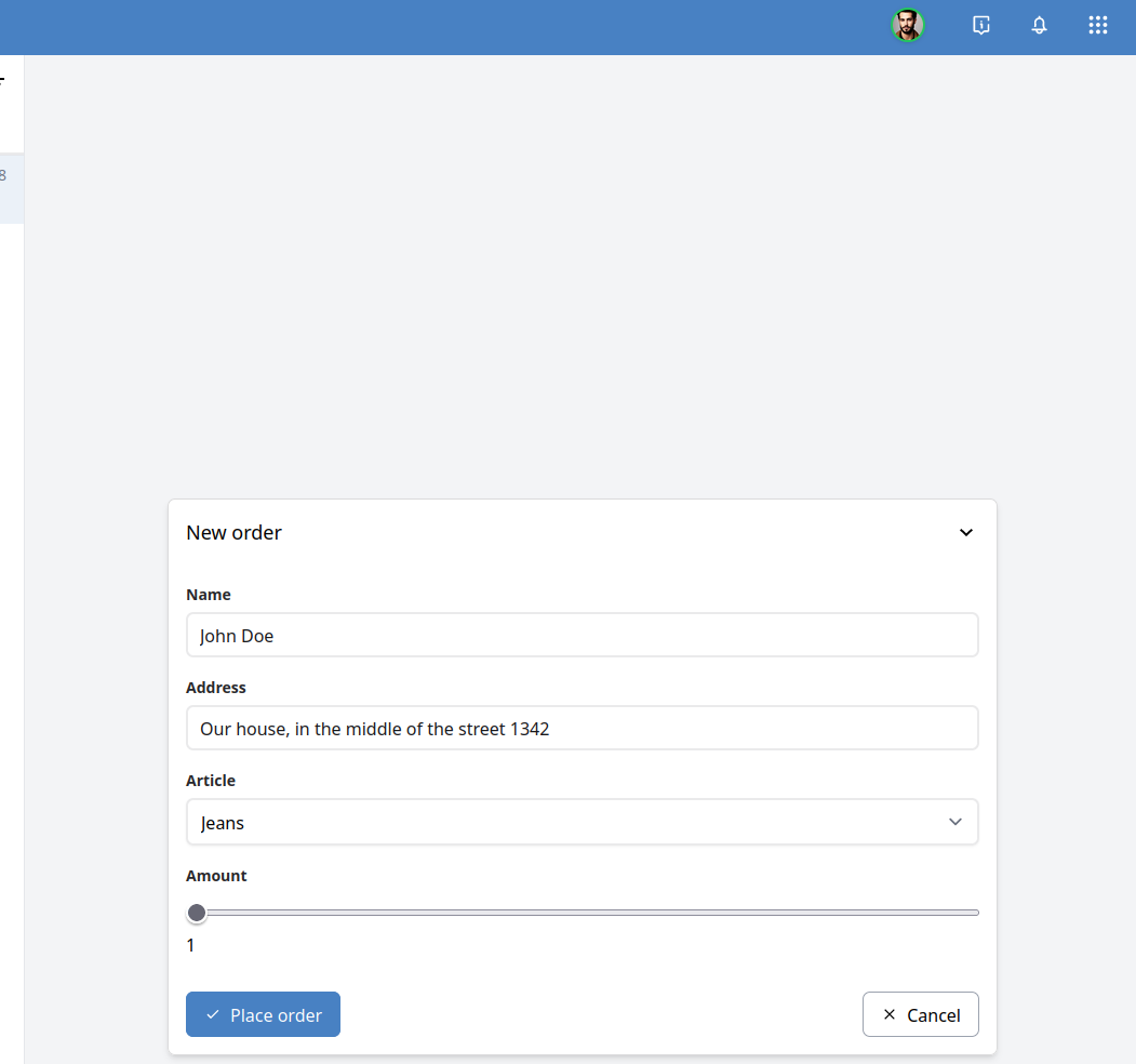
Forms
It's possible to design forms that send validated data in an event to Bubble. This uses JSON schema and a UI schema to render the form in the inbox. The bot can even prefill known data before the operator is presented with the form. To accomplish this, we'll split the form into two steps:
- Gathering information and then rendering the form.
- Dealing with the form submission.
In this example we'll emulate the placing of an order. We'll create two separate events in the commands.yaml, place_order and prepare_place_order:
commands:
  place_order:
    schema:
      type: object
      required: ["name", "address", "article", "amount"]
      properties:
        name:
          type: string
        address:
          type: string
        article:
          type: string
          enum: ["tshirt", "jeans", "hat"]
          enumNames: ["T-shirt", "Jeans", "Hat"]
        amount:
          type: integer
          minimum: 1
          maximum: 10
    ui_schema:
      ui:i18n_title:
        en: New order
        nl: Nieuwe bestelling
        de: Neue Bestellung
        es: Nuevo orden
      ui:submitButtonOptions:
        i18n_submitText:
          en: Place order
          nl: Plaats order
          de: Bestellung aufgeben
          es: Realizar pedido
      ui:order: ["name", "address", "article", "amount"]
      name:
        ui:i18n_title:
          en: Name
          nl: Naam
          de: Name
          es: Nombre
      address:
        ui:i18n_title:
          en: Address
          nl: Adres
          de: Adresse
          es: Dirección
      article:
        ui:i18n_title:
          en: Article
          nl: Artikel
          de: Artikel
          es: Artículo
      amount:
        ui:i18n_title:
          en: Amount
          nl: Aantal
          de: Anzahl
          es: Número
        ui:widget: range
  prepare_place_order: {}
ui_commands:
- command: prepare_place_order
  caption:
    en: Place order
    nl: Plaats order
    de: Bestellung aufgeben
    es: Realizar pedido
The above YAML file highlights some new constructs:
- Having a schema and UI schema in the commands file. References for both are available on this page.
- Adding translations for the Inbox UI. This can be especially important if you have operators using different languages. All of the
Inbox.*commands support translations.
Now we wire it up with Bubble:
# The prepare task will render the form with (optionally) pre-filled data.
task event: "prepare_place_order" do
  _form = Inbox.form(
    # Note that it's also possible to define the (ui)schema completely inline in Bubble;
    # it doesn't have to be in the commands file.
    schema: @commands.commands.place_order.schema,
    ui_schema: @commands.commands.place_order.ui_schema,
    data: %{
      # Here we can intelligently fill the form data by fetching data
      # using an HTTP request, from the globals, etc.
      "name" => "John Doe",
      "address" => "Our house, in the middle of the street 1342"
      "amount" => 1
      # Not everything needs to be filled in. The rest must be filled by the operator.
    },
    # The event that will be called with the validated data.
    event: "place_order"
  )

  emit "$inbox", _form, to: :operator
end

# The actual form submission is handled here
task event: "place_order" do
  # The `event.payload` will be a map with `operator` (who submitted the form)
  # and `form` which contains the validated data according to the schema.
  _data = event.payload.form
  _operator = event.payload.operator

  http_post("https://my-ordering-system.example.com", json: %{
    "order" => %{
      "name" => _data.name,
      "address" => _data.address,
      "article" => _data.article,
      "amount" => _data.amount,
      "order_placed_by" => _operator.email
    }
  })
end
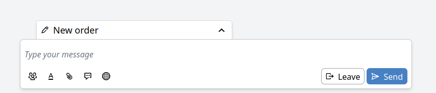
Now, when the "Place order" button (from the ui_commands) is clicked, an event will be sent to Bubble ("prepare_place_order"). This will render the form in the Inbox:
It's also possible to temporarily collapse the form to continue chatting and later finish the form:
Refer to the references below for the fully supported feature set of the form rendering.
commands.yaml reference
The commands.yaml lists the commands that are available and which of those should be visible as a button in the Inbox interface. The file may exist as part of apps and skills.
It contains an object with two keys, commands and ui_commands.
The commands key contains a map keyed by the event name.
The value must be an object with an optional schema and ui_schema.
Different commands.yaml files may have conflicting keys and can therefore override each other.
The ui_commands key must contain a list of objects, where each object contains a command (string) with the command to be called when the button is clicked, and a caption which is either a string or an object keyed by language tag.
For example:
commands:
  greet_operator: {}
ui_commands:
- command: greet_operator
  caption: Greet operator
  # or:
  caption:
    en: Greet operator
    nl: Begroet operator
    # ...
The language that's used to render the caption is dependent on the interface language of the operator.
The ui_commands is also used as a filter for the Inbox.toast :buttons option.
This option contains a list of event names. Only the names that also exist within the ui_commands are rendered.
For example, we can combine the operator greeting and the order placing examples:
task event: "$operator_join" do
  emit "$inbox", Inbox.toast("Hello, #{conversation.operator.first_name}!", buttons: ["prepare_place_order"]), to: :operator
end
Schema reference
The form rendering uses a subset of JSON Schema to define the validation and the basic UI. An additional UI schema can be used to tweak the form.
The schema that's passed to Inbox.form must always start with a top-level object:
# Valid:
Inbox.form(schema: %{
  "type" => "object",
  "properties" => %{
    "name" => %{"type" => "string"}
  }
})

# Invalid:
Inbox.form(schema: %{"type" => "string"})
All basic types are supported: string, integer, number, boolean, object, array.
References ($ref, et al) are not supported.
Validation for the basic types is also supported:
| Type | Supported validations |
|---|---|
| string | maxLength, minLength, pattern |
| integer/number | minimum, maximum, multipleOf |
| array | maxItems, minItems |
| object | required |
enum is also allowed, however a type must still be given. For example:
type: object
properties:
  product:
    type: string
    enum: ["first", "second"]
  count:
    type: integer
    enum: [1, 2, 3]
UI schema reference
The UI schema acts as an additional schema alongside the JSON schema to determine how the form should be rendered. The structure of the UI schema resembles the JSON schema; it's a nested map where each level corresponds to a field. The top-level UI schema matches the top-level object in the schema.
schema:
  type: object
  properties:
    name:
      type: string
    things:
      type: array
      items:
        type: string
ui_schema:
  ui:title: Title of the object.
  name:
    ui:title: Title of the name field.
  things:
    ui:title: Title of the array field
    items:
      ui:title: Title of each item in the array.
Options for a field can be passed either a ui:<property> or in a ui:options map.
So the following UI schema is equivalent to the one above:
ui_schema:
  ui:options:
    title: Title of the object.
  name:
    ui:options:
      title: Title of the name field.
  things:
    ui:options:
      title: Title of the array field
    items:
      ui:options:
        title: Title of each item in the array.
In the following sections, "Translation map" will refer to a map where the key is the language code and the value is the text for that language.
These should correspond to languages supported by the studio.
If the operator's language is missing from the map, it will default to English.
If English is missing, it will default to the first translation in the map that it can find.
All fields that start with i18n_ are translation maps (e.g. i18n_title, i18n_description, etc).
For example:
ui:1i8n_title:
  en: Name
  nl: Naam
  de: Name
  es: Nombre
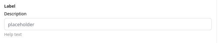
Each property has a label, an optional description, the input control, and an optional help text:
Labels
Each input field is accompanied by a label. The label is derived in the following order:
- The
ui:i18n_titleproperty on the UI schema. Translation map. - The
ui:titleproperty on the UI schema. String. - The
titleproperty on the schema. String. - The property name.
The showcase where each of these is located, the following schema contains all of them. Here, the ui:i18n_title would be used. It is not needed to supply them all.
schema:
  type: object
  properties:
    name:
      type: string
      title: Name
ui_schema:
  name:
    ui:1i8n_title:
      en: Name
      nl: Naam
      de: Name
      es: Nombre
    ui:title: Name
Description
Below the label is an optional description. Its value is derived as follows:
- The
ui:i18n_descriptionproperty on the UI schema. Translation map. - The
ui:descriptionproperty on the UI schema. String. - The
descriptionproperty on the schema. String.
The showcase where each of these is located, the following schema contains all of them. Here, the ui:i18n_description would be used. It is not needed to supply them all.
schema:
  type: object
  properties:
    name:
      type: string
      description: Must be the full name.
ui_schema:
  name:
    ui:i18n_description:
      en: Must be the full name.
      nl: Moet de volledige naam zijn.
    ui:description: Must be the full name.
The description may optionally be written in Markdown; however, the ui:enableMarkdownInDescription: true must be passed, either as a global option, or on the specific field:
schema:
  type: object
  properties:
    name:
      type: string
    other:
      type: string
ui_schema:
  # Enable it for all descriptions:
  ui:globalOptions:
    enableMarkdownInDescription: true
  name:
    # Or just for this field.
    ui:enableMarkdownInDescription: true
  other:
    # override the global
    ui:enableMarkdownInDescription: false
Help text
Below the input field is an optional help text. Its value is derived as follows:
- The
ui:i18n_helpproperty on the UI schema. Translation map. - The
ui:helpproperty on the UI schema. String.
The showcase where each of these is located, the following schema contains all of them. Here, the ui:i18n_help would be used. It is not needed to supply them both.
schema:
  type: object
  properties:
    name:
      type: string
ui_schema:
  name:
    ui:i18n_help:
      en: Must be the full name.
      nl: Moet de volledige naam zijn.
    ui:help: Must be the full name.
Widgets and fields
Widgets change the input control.
They are passed as a ui:widget option in the UI schema.
The following widgets are available.
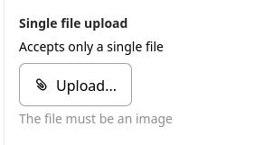
file
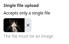
For a single file:
schema:
  type: object
  properties:
    file:
      # Will contain a URL after the file is submitted
      type: string
ui_schema:
  file:
    ui:title: Single file upload
    ui:description: Accepts only a single file
    ui:help: The file must be an image
    ui:widget: file
    ui:accept: ["image/*"]
For a list of files:
schema:
  type: object
  properties:
    files:
      type: array
      maxItems: 5
      items:
        type: string
ui_schema:
  files:
    ui:title: Multi file upload
    ui:description: Accepts up to 5 files
    ui:help: Can be any file
    items:
      ui:widget: file
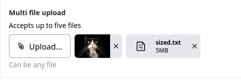
It's possible to drag files from the "Media" tab in the sidebar into the field, or from the user's file system.
autosize_textarea
Only available for type: string.
A textarea that automatically resizes based on the size of its content.
ui:widget: autosize_textarea
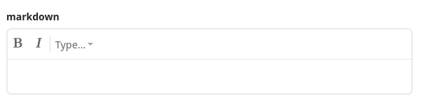
markdown
Only available for type: string.
Renders a rich-text editor where the result is stored in Markdown.
ui:widget: markdown
password
Only available for type: string.
Renders the input as a password field, where the contents are not readable.
ui:widget: markdown
range
Only available for type: number and type: integer
Renders the input as a range slider.
Requires the minimum and maximum rules to be set on the schema.
schema:
  type: object
  properties:
    rating:
      type: integer
      minimum: 1
      maximum: 10
ui_schema:
  rating:
    ui:widget: range
The multipleOf rule can be used to change the step size of the slider.
schema:
  type:
    rating:
      type: number
      minimum: -100
      maximum: 100
      multipleOf: 0.1
ui_schema:
  rating:
    ui:widget: range
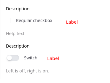
switch
Only available for type: boolean.
Renders the input as a switch instead of a boolean.
ui:widget: switch
Submit button
By default the form submit button will contain the text "Submit".
It's possible to change this with the ui:submitButtonOptions object.
ui:submitButtonOptions:
  # i18n_submitText takes precedence. Only one of these is needed.
  submitText: Place order
  i18n_submitText:
    en: Place order
    nl: Plaats order
    de: Bestellung aufgeben
    es: Realizar pedido
Readonly & disabled
The readonly and disabled attributes can be passed either on the specific field, or in the globalOptions.
If it's set on the specific field, then it takes precedence over the global option.
String input formats
String inputs may define a format which will be used to render the <input type=.
The following formats are supported:
date-time,date,time,email,color
schema:
  type: object
  properties:
    datetime:
      type: string
      format: date-time
    date:
      type: string
      format: date
    time:
      type: string
      format: time
    email:
      type: string
      format: email
    color:
      type: string
      format: color
Alternatively, the ui:inputType can be used to accomplish the same.